logodesign
packaging
branding

logodesign
packaging
branding
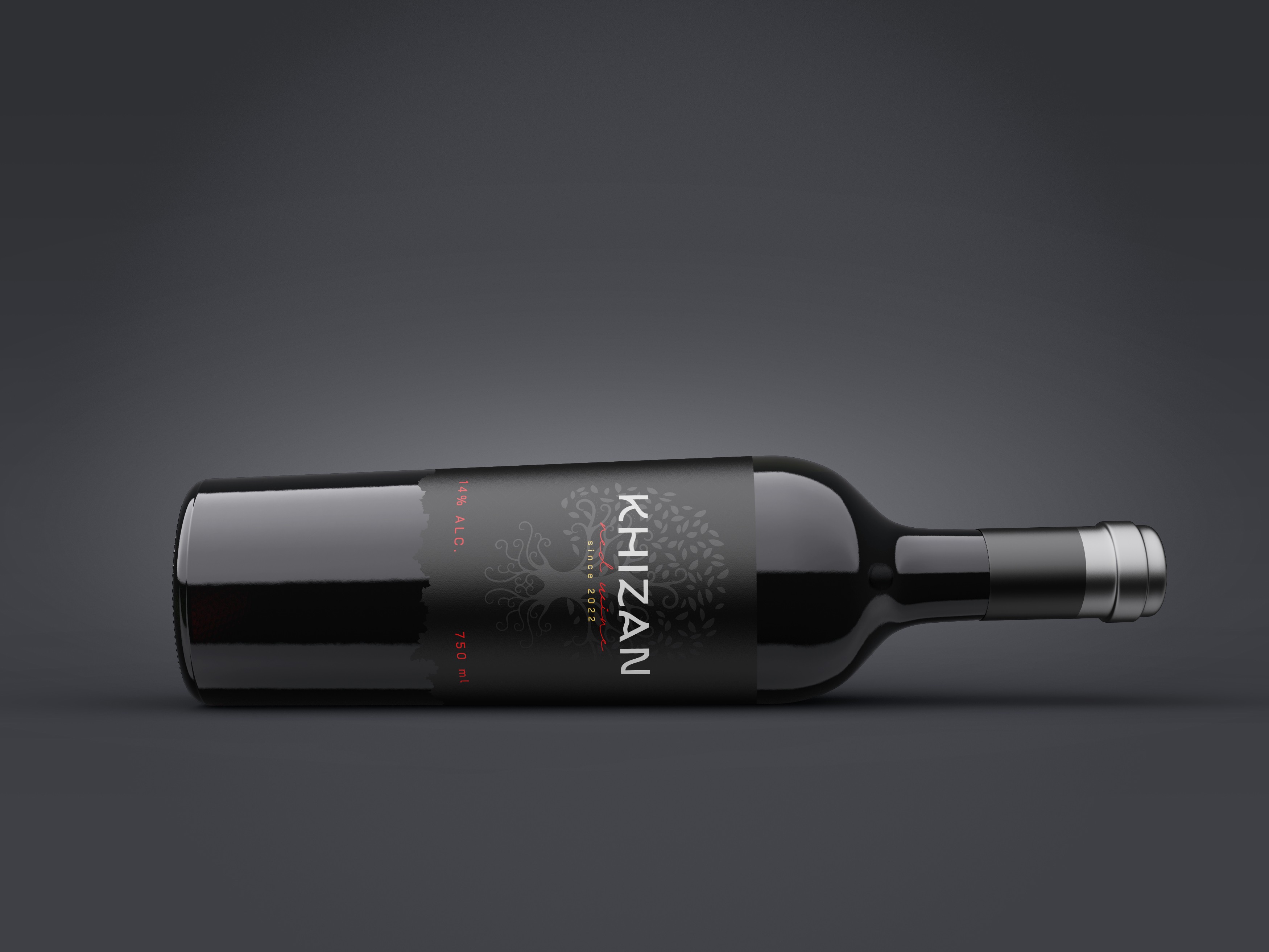
Objective:
The goal of this project was to create an elegant and timeless label design for Khizan, a premium wine brand offering both red and white varieties. The design aims to reflect sophistication, nature’s balance, and the artisanal quality of the wine.
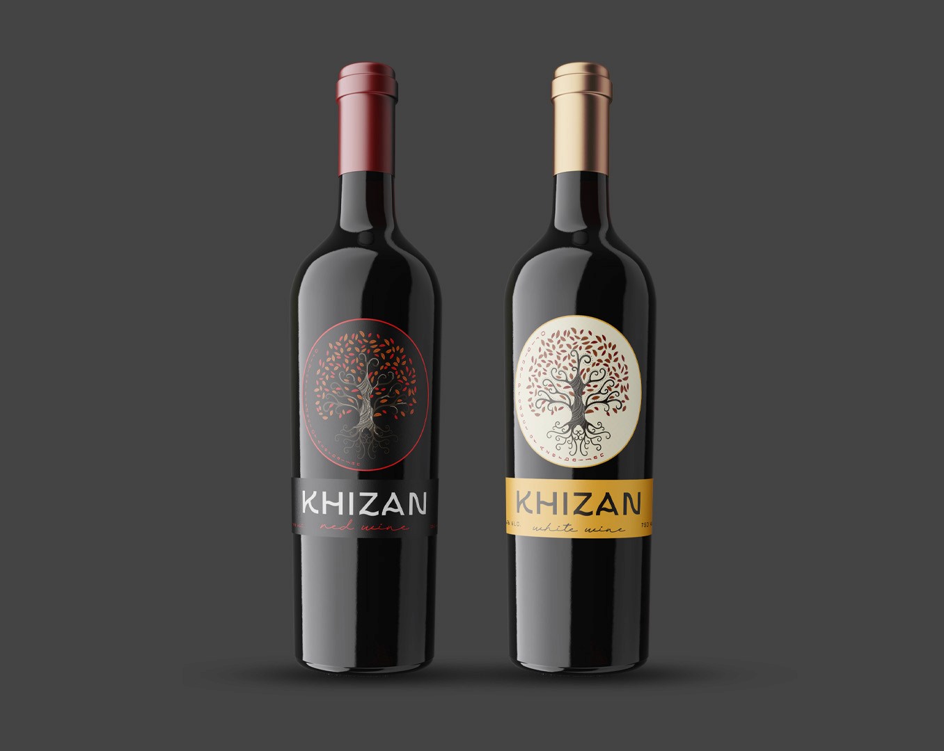
Concept & Inspiration:
The central element of the label is the Tree of Life, symbolizing growth, roots, and connection to nature — values that mirror the wine-making process itself. Each variant carries its own distinct color palette while maintaining cohesive visual identity:
Red Wine: Deep black and crimson tones evoke richness, intensity, and warmth.
White Wine: Soft cream and gold accents convey freshness, delicacy, and lightness.
Design Elements:
A minimal yet detailed emblem emphasizing natural flow and organic beauty.
Modern typography for the logo “KHIZAN” complements the traditional illustration, achieving a balance between classic and contemporary.
Color-coded neck foils and labels enhance differentiation between wine types while maintaining brand consistency.
Outcome:
The final result is a refined, visually balanced design that speaks to both premium quality and emotional connection. It stands out on the shelf through its clean structure and symbolic storytelling, making Khizan a memorable choice for wine lovers.
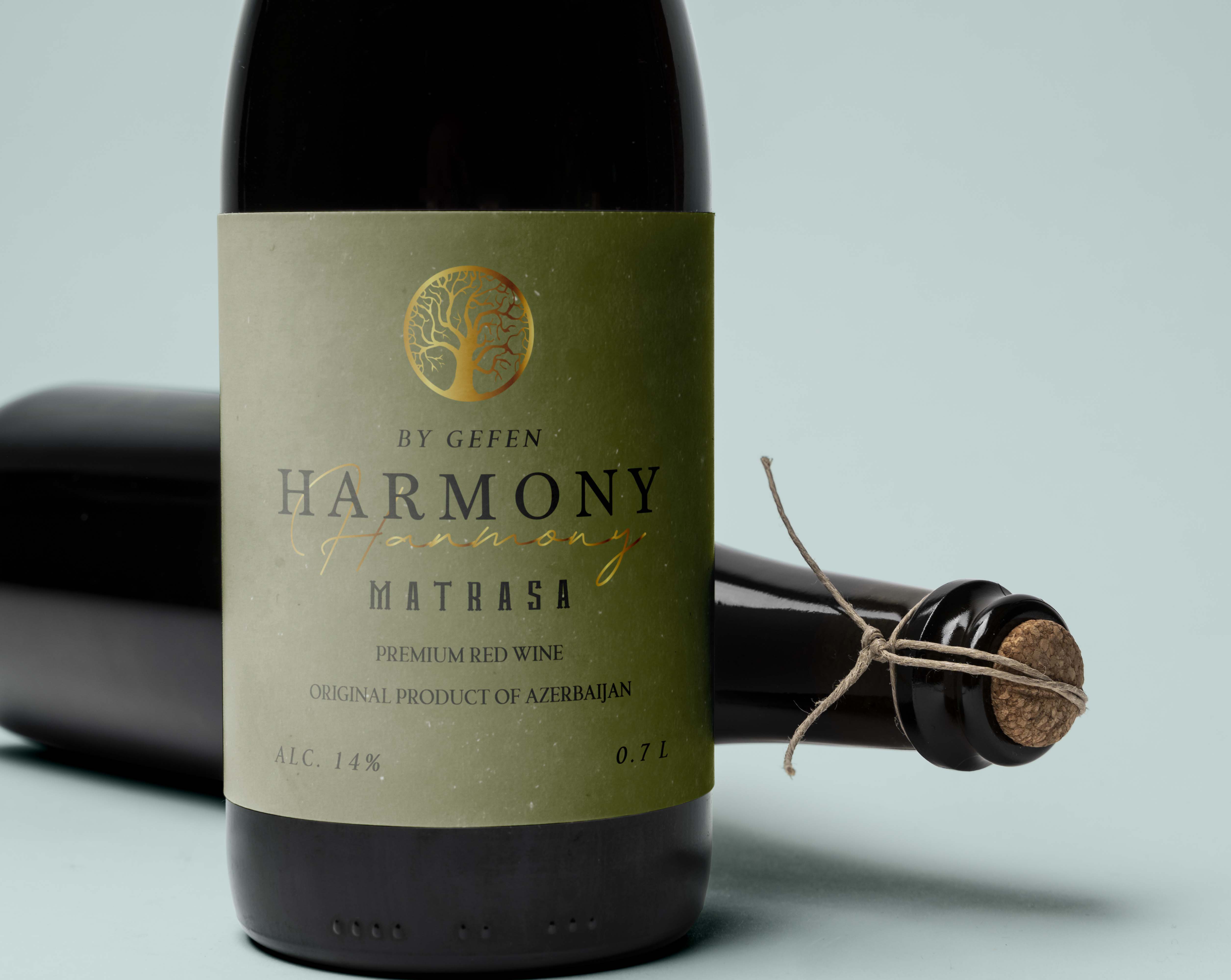
"Harmony Wine"
Objective:
The aim of this project was to design a premium label for Harmony, a red wine made from the traditional Azerbaijani Matrasa grape variety. The concept sought to embody balance, craftsmanship, and cultural authenticity through refined visual storytelling.
Concept & Inspiration:
The brand name Harmony reflects the natural equilibrium between tradition and innovation in winemaking. Inspired by the serene tones of vineyards and the organic process of fermentation, the design merges modern minimalism with a warm, earthy touch. The Tree of Life symbol, subtly embossed in gold foil, represents rooted heritage, growth, and the essence of harmony with nature.
Design Elements:
Muted olive-green background to evoke natural calmness and sophistication.
Contrasting gold and black typography for a balance of elegance and clarity.
Foil-stamped emblem adds a luxurious tactile detail and reinforces the brand’s premium positioning.
Minimal text layout ensuring a clean and timeless look.
Outcome:
The result is a sophisticated and grounded label that communicates authenticity and refinement. Harmony stands out as a premium Azerbaijani wine — one that celebrates both its origins and the artistry of winemaking.
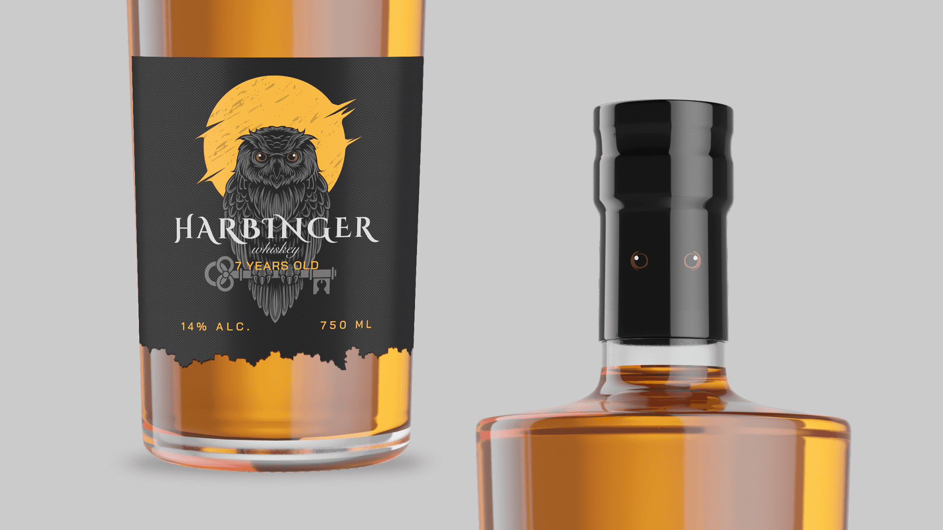
"Harbinger" whiskey
Objective:
The goal of this project was to design a distinctive and bold label for Harbinger, a whiskey brand that embodies mystery, strength, and wisdom. The visual identity had to feel powerful and premium, appealing to a modern audience while maintaining a timeless spirit.
Concept & Inspiration:
The design draws inspiration from the symbolism of the owl — a harbinger of insight and foresight — representing the brand’s essence of maturity and depth. Each variant features a unique color accent (orange, yellow, or red) behind the owl illustration, evoking different stages of dusk and dawn, symbolizing the aging and richness of whiskey over time.
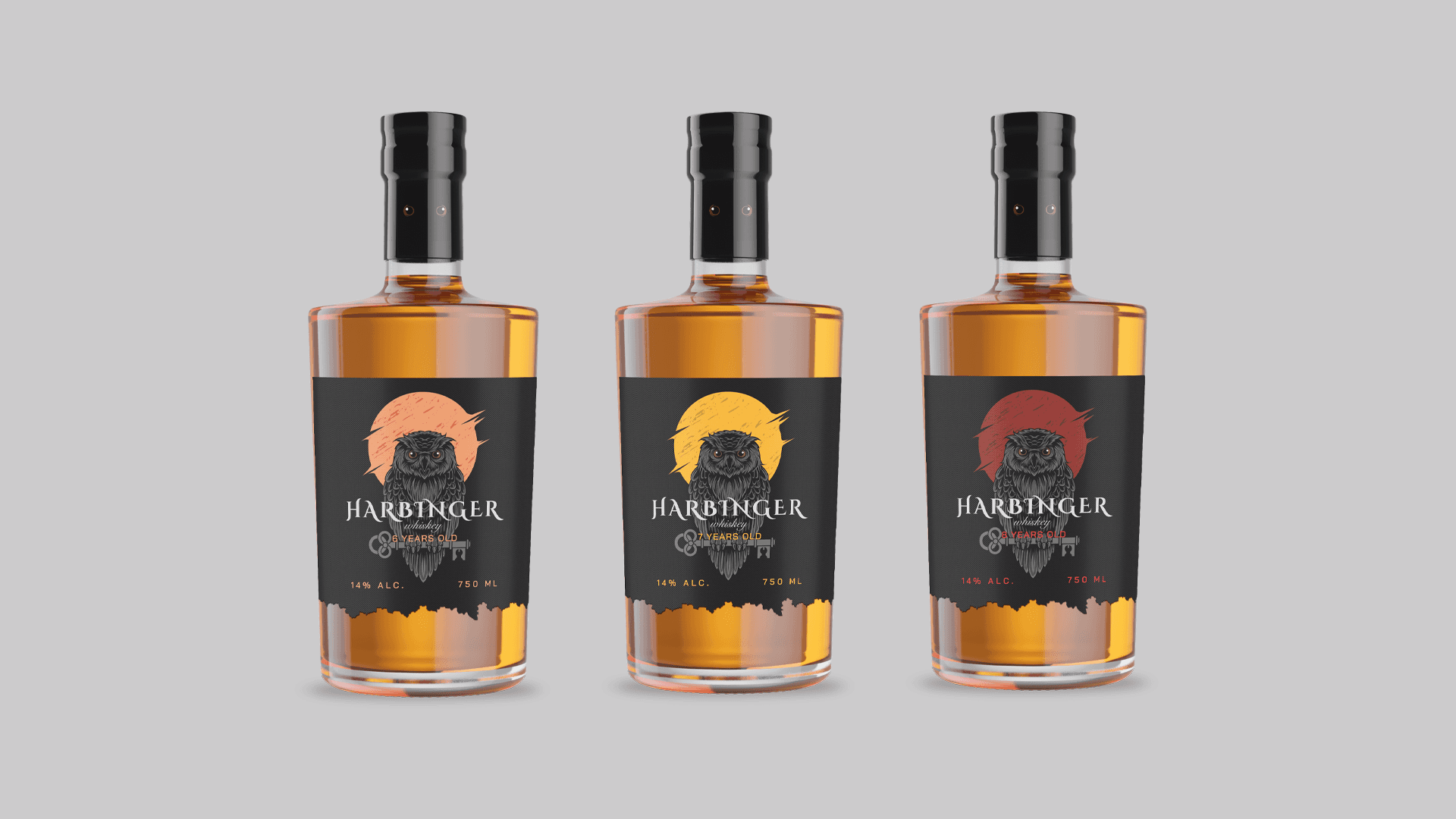
Design Elements:
A hand-drawn owl illustration as the central visual focus, adding a sense of craftsmanship and intrigue.
Dark background to enhance contrast and highlight the golden hues of the whiskey.
Minimal typographic composition with serif lettering that conveys refinement and strength.
Subtle color variations to differentiate each bottle type while preserving brand unity.
Outcome:
The final design delivers a bold, mysterious, and sophisticated presence. Harbinger Whiskey stands out with its symbolic storytelling and cohesive design system, appealing to both collectors and casual enthusiasts who value depth, artistry, and quality.
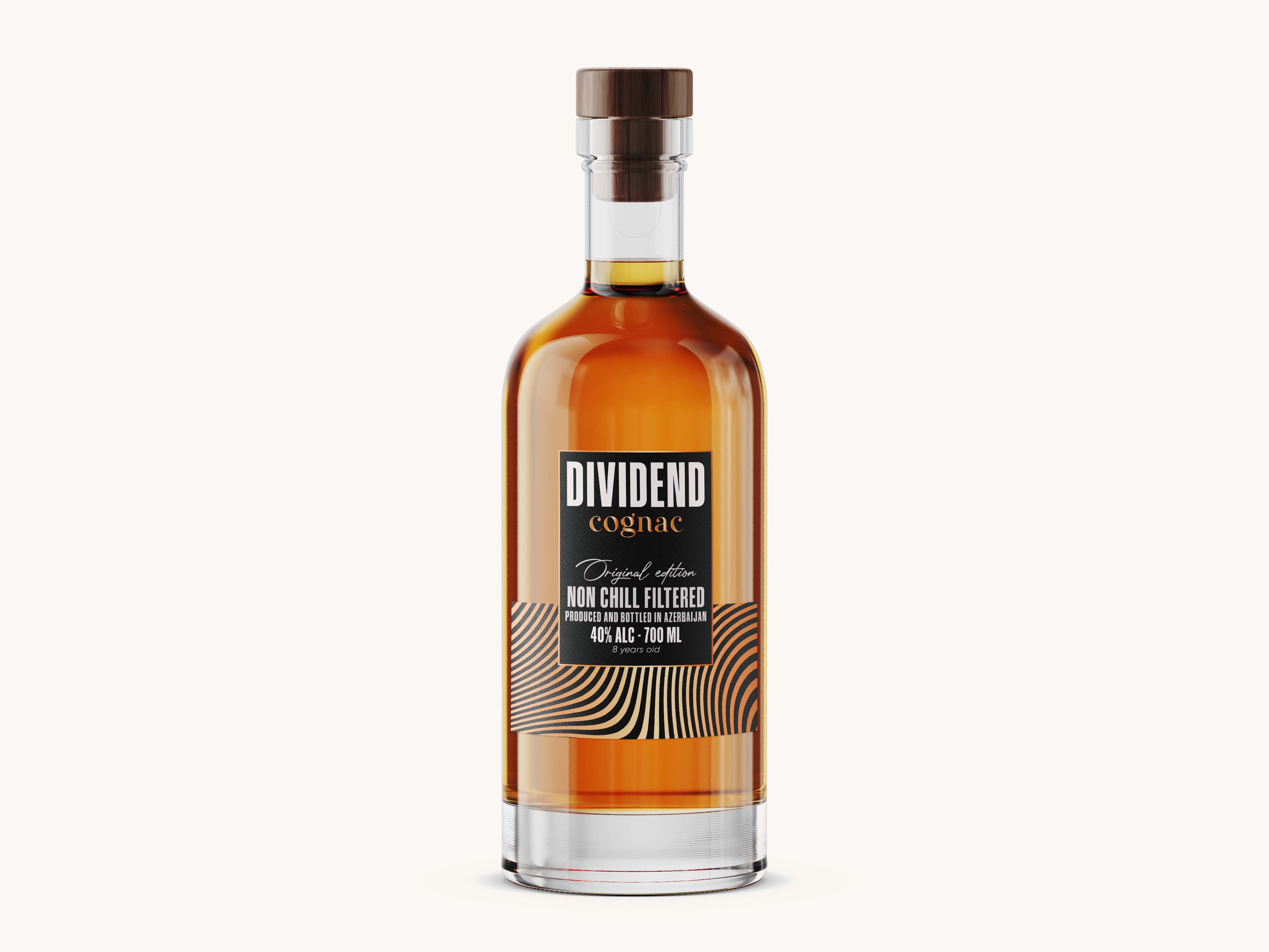
"Dividend" Cognac
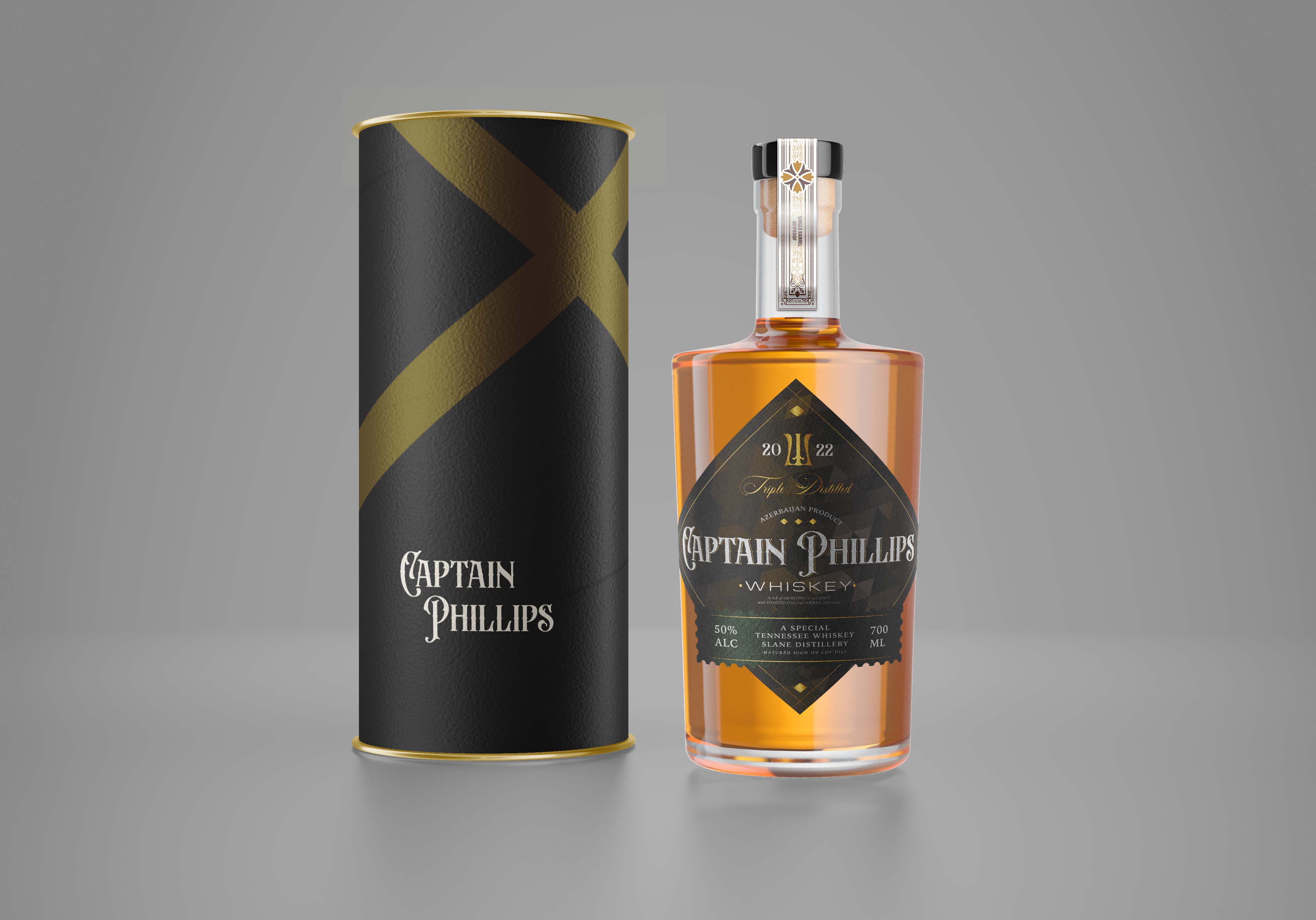
"Captain Philips" Whiskey
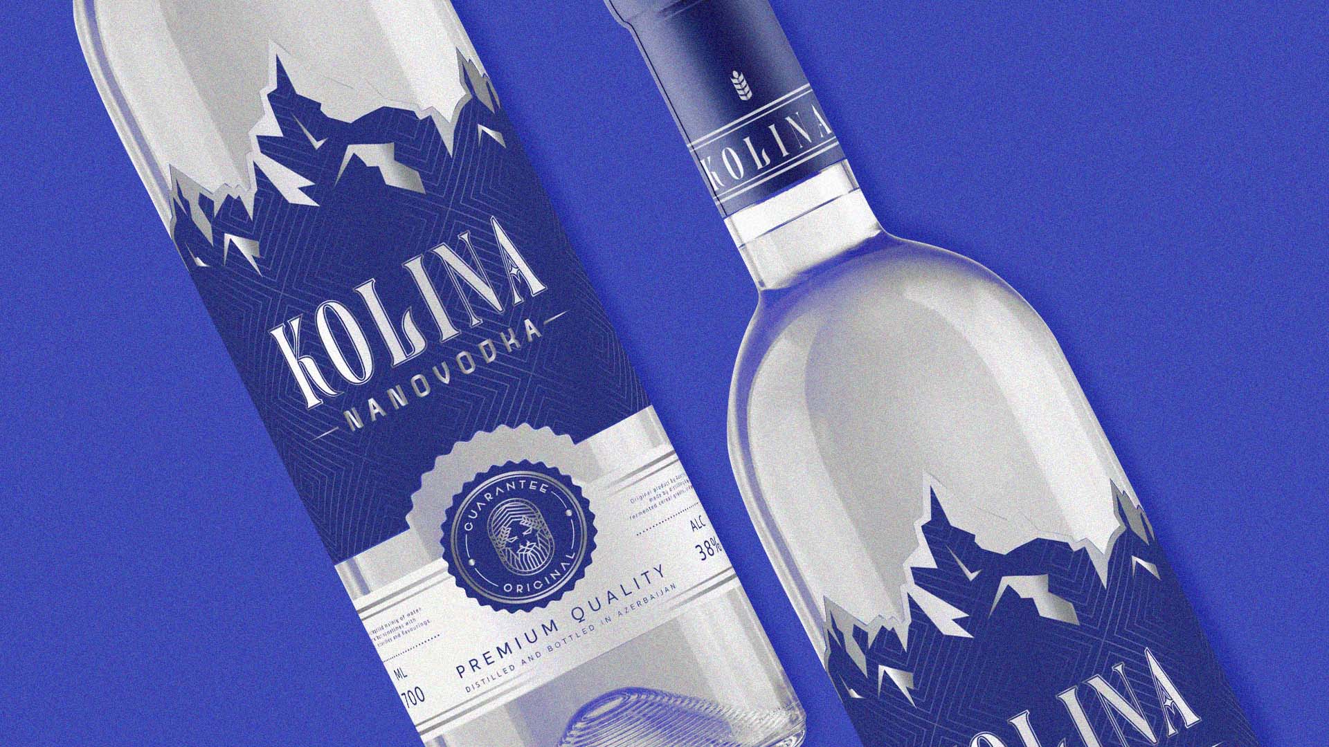
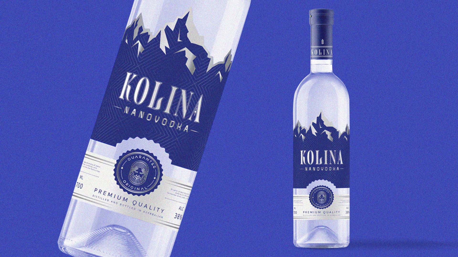
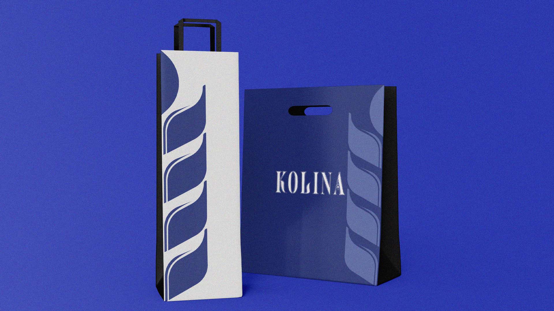
"Kolina" Vodka
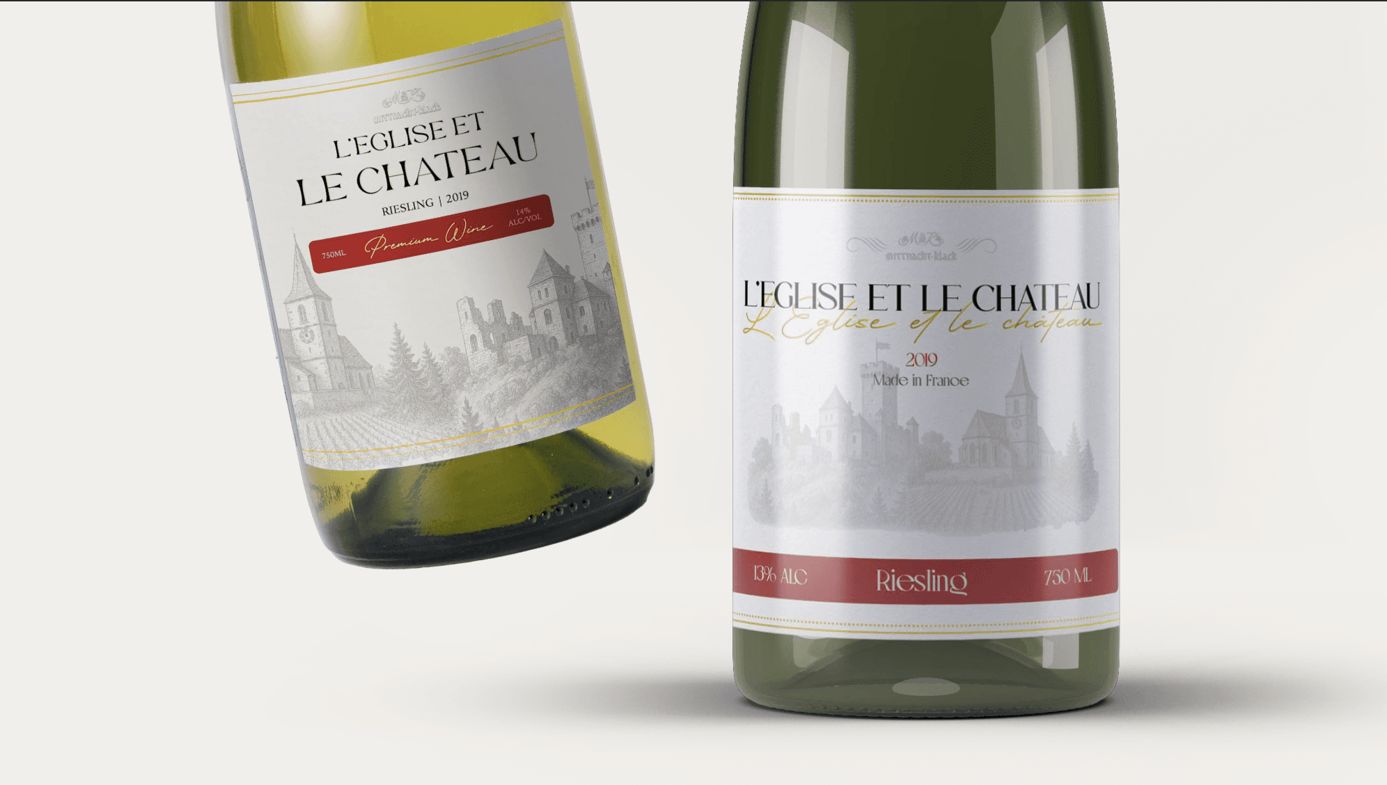
"L'eglise Et Le Chateau" Wine